.png)

More Than Fabric: The Kits Ushering in a New Chapter for Women’s Football in Canada
Bold. Vibrant. Unapologetic.
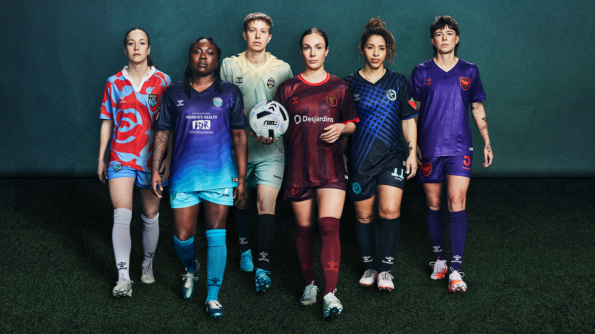
Women's football in Canada is not just on the rise, it is experiencing a transformative era. With the launch of the Northern Super League (NSL), a new chapter unfolds, and this evolution is further solidified through the unveiling of official home kits for the league’s six founding clubs. In collaboration with Hummel, the NSL has delivered jerseys that go beyond aesthetics; they encapsulate identity, deep-rooted community connections, and an undeniable statement of intent.
Much like Nike’s recent team away kits, these latest releases are bold, symbolic, and deeply inspired by the essence of each club. They tell a story of resilience, passion, and an unwavering commitment to success making them more than just sportswear but an emblem of a movement.
As the league embarks on its historic first season, the clubs have embraced the opportunity to make a lasting impression. And with these jerseys? They certainly have.
A Closer Look at the Six Founding Club Kits
Calgary Wild FC – A Tribute to the Dusky Skies
The Calgary Wild FC jersey is a sleek and striking design, draped in shades of purple inspired by the city’s dusky skies. A standout feature is the owl crest, a symbol of patience, precision, and deadly efficiency qualities every footballer would want to embody on the pitch. This jersey is a blend of nature’s beauty and sporting ambition, making it an instant classic.

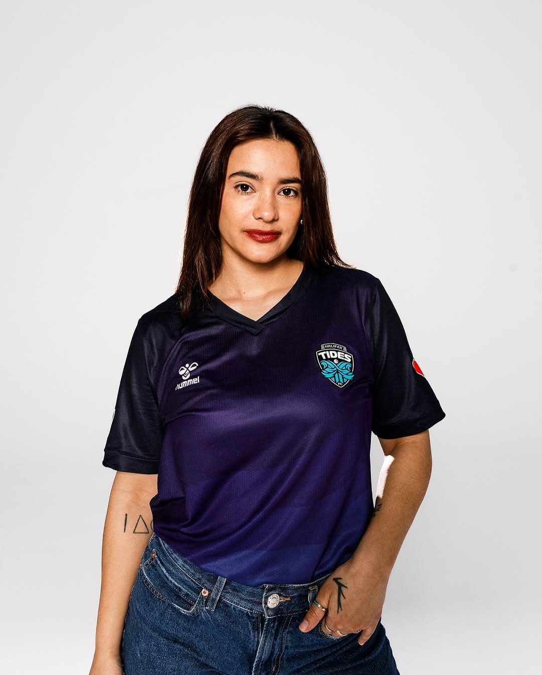
Halifax Tides FC – The Rhythm of the Ocean
Bearing a similar colorway to Calgary Wild FC, the Halifax Tides FC kit distinguishes itself with a design that flows like the ocean, a visual representation of both tranquility and momentum. The calm yet dynamic aesthetic mirrors the team’s commitment to equity in sports and their unwavering drive for success.
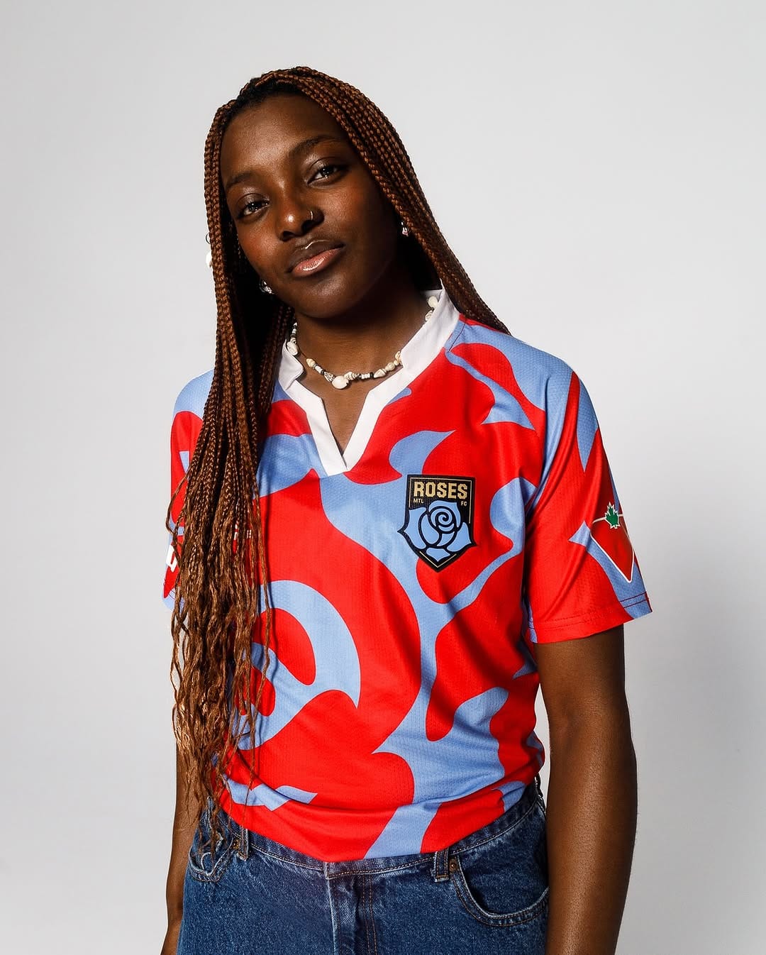
Roses de Montreal: A Celebration of Courage & Diversity
Fan favorite- The design is rich in symbolism, representing courage, creativity, and diversity. The stunning rose motif woven into the kit signifies the blossoming of each player and the team itself as a powerful emblem of growth and unity. Off the pitch, this jersey is an absolute fashion staple, seamlessly blending sportswear with streetwear.
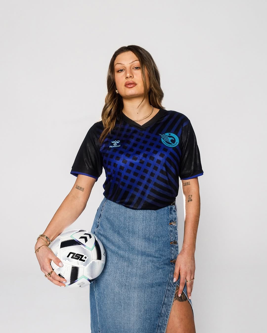
Ottawa Rapid FC – Speed in Motion
Sporting a bold blue checkered design, the Ottawa Rapid FC jersey is a celebration of raw speed and relentless energy. Every detail of this kit reflects a team built to move swiftly and dominate the game, making it a perfect representation of Ottawa’s competitive spirit.
AFC Toronto – A Bold Yet Minimalist Statement
Toronto’s maroon-colored home shirt is simple yet impactful. The contrasting patterns add depth and zest, embodying Toronto’s progressive and forward-thinking ethos. While it doesn’t scream for attention, its bold elegance makes it a design to admire.

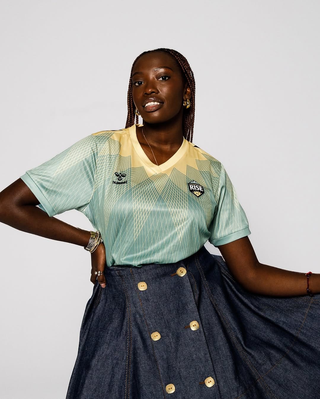
Vancouver Rise FC – Radiance & Ambition
Vancouver Rise FC’s jersey captures the vibrancy and brilliance of the sun, reflecting the energy and ambition of the team. The sunray-inspired pattern spreads across the fabric, illuminating the club’s determination and warmth which is a design destined to light up the pitch and inspire players.
A New Era for Canadian Women's Football
The launch of these jerseys marks more than just the beginning of the Northern Super League; it signifies a powerful shift in Canadian women's football. Each kit is not only beautifully designed but deeply meaningful, embodying the culture, community, and strength that define the league.
With these striking uniforms, Canada’s women's football scene is making a bold statement to the world, this is a league that has come to stay, and it is only the beginning.
Which jersey is your favorite? Let us know in the comments!
Image Credits: Hummel