Ranking 2024/25 Premier League Club Kits: The Best, Bad, and Most Unusual
We explore some of the best looks we can expect to see on the pitch in the new season, based on the Premier League home kit launches so far
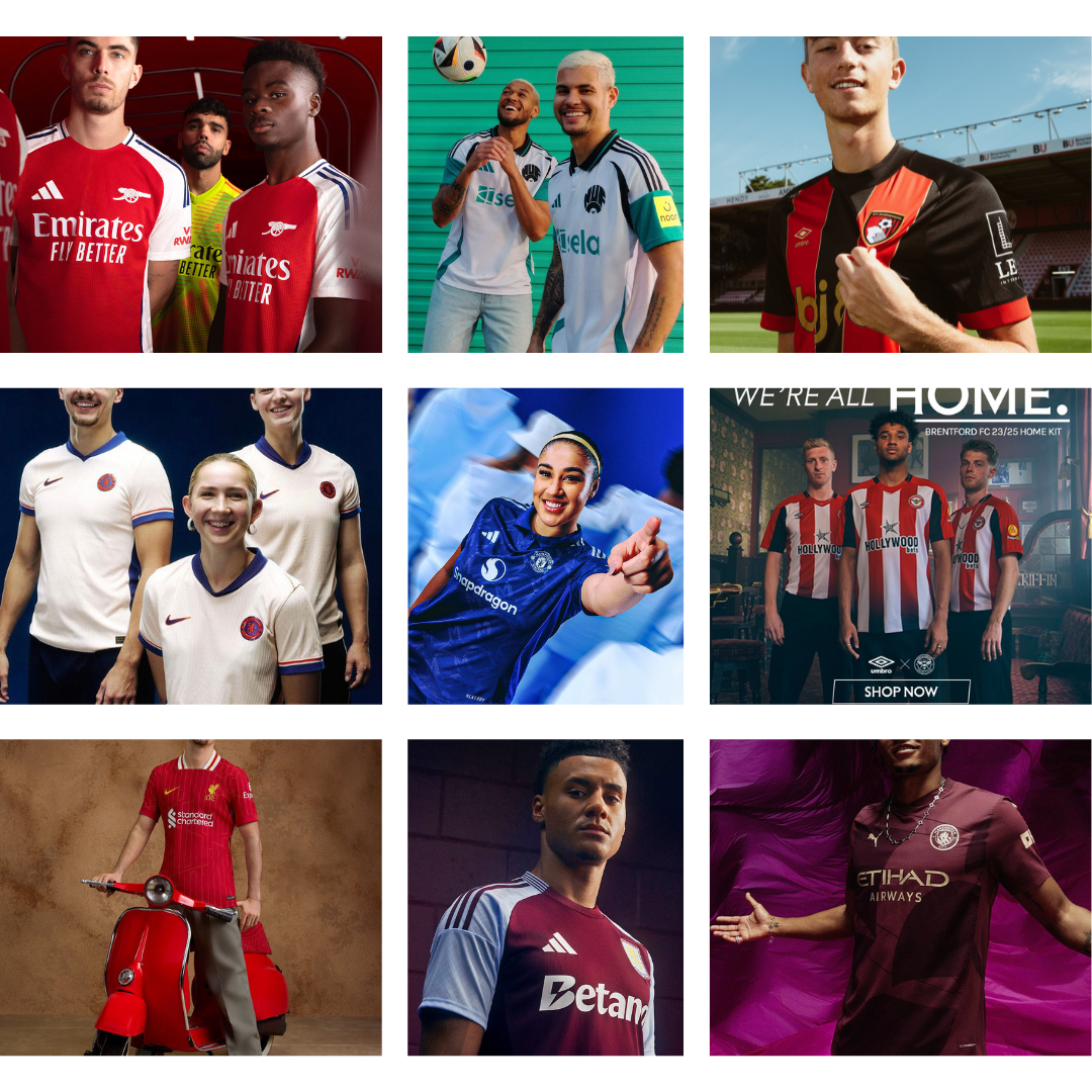
In the past weeks, we have seen jersey releases from all 20 Premier League clubs, with each day bringing a new unveiling by the clubs and their respective manufacturers. These releases, varying in the effort put into their design and promotion, ensure that teams are well-equipped and stylishly groomed for the upcoming season.
Each season, we see a range of unique and innovative jersey designs that contribute to the excitement and engagement of fans. This year is no different, with new patterns, silhouettes, upgraded logos, and subtle design elements making their debut. These changes not only showcase the creativity of the designers but also enhance the visual appeal of the game, increasing fan activities and interactions.
The Best
Newcastle United Third
Something about the mint colorway and collar pattern.
It’s mint! 💚
— Newcastle United FC (@NUFC) July 30, 2024
Introducing our 2024/25 Newcastle United third kit!
Available now on the official club website and in the official club store at St. James’ Park.
Chelsea Away
A blend of simplicity and uniqueness, the blue collar pattern is an absolute work of art, red outline on the swoosh is exceptional.
The boys in our 24/25 away.#WeBurnBlue
— Chelsea FC (@ChelseaFC) July 30, 2024
Arsenal Home
Featuring the retro cannon badge, the Arsenal shirt is a simply clean one with all elements fitting well together.
The Year of the Cannon 🔴⚪️
— Arsenal (@Arsenal) May 16, 2024
Our new 24/25 Arsenal x @adidasFootball home kit is available now 👇
Brentford FC
The club who allowed its fans keep the same shirt for two seasons, the 24/25 Brentford kit looks not conventionally nice however the beauty lies in the red/black gradient and sponsor placement which is not some fans favorite.
Whether you've seen it all or just joined the journey. We're all Brentford. We’re all home.
— Brentford FC (@BrentfordFC) July 14, 2023
Shop now 👉 https://t.co/m2CIOSsq2i pic.twitter.com/3DweqPy42c
The Bad
Bad as in bad, not the "bad" good, Anyway, here are some Premier League jerseys that we think missed the mark."
AFC Bournemouth
"Wait, stay with me. It's not that this shirt is inherently bad design-wise; it's just that the turtleneck-like neckline doesn't sit well with us
Introducing our new 2024/25 home kit 🔥 pic.twitter.com/bkE5l9My1o
— AFC Bournemouth 🍒 (@afcbournemouth) July 30, 2024
Crystal Palace Home
It looks quite intense and seems completely different from what they’ve had in the past, fitting into the unusual category. However, this isn't the first time we've seen something somewhat disruptive.
Now it's our turn.
— Crystal Palace F.C. (@CPFC) June 14, 2024
24/25 home kit ✨
Nott'm Forest Home
No words needed here; it's not terrible, but it looks more like a training shirt.
Just landed — our 2024/25 home shirt.
— Nottingham Forest (@NFFC) July 13, 2024
Available to buy from 19th July 🤩 pic.twitter.com/dD1oyFp4Rj
The Unusual
Manchester City Thirds
It's nice to see City exploring new colors.
Introducing the @pumafootball x Man City 24/25 Third Kit 🙌
— Manchester City (@ManCity) July 26, 2024
Shop now! 👇
Chelsea Home
Beautifully and uniquely crafted, an exceptional creation featuring a bold, flame-inspired design.
First outing. 👕
— Chelsea FC (@ChelseaFC) July 25, 2024
Please note that Infinite Athlete will appear on front of shirt for pre-season only. pic.twitter.com/NUQj3YTMlP
Manchester United Away
Blue us away- pun intended
For the fearless 🗣️
— Manchester United (@ManUtd) July 25, 2024
Introducing our new 2024/25 away kit, available now 💙#MUFC || @adidasFootball
.png)


